Audit preparedness and compliance for major healthcare plans.

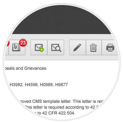
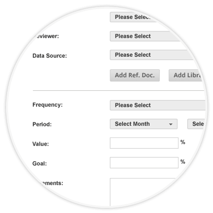
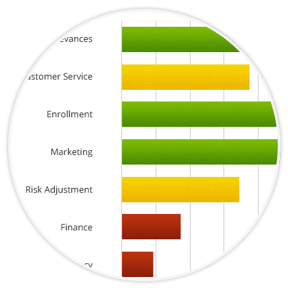
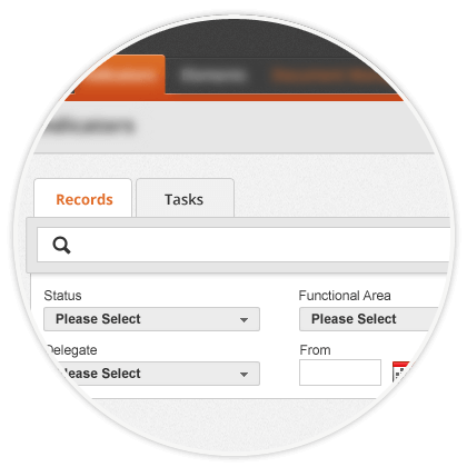
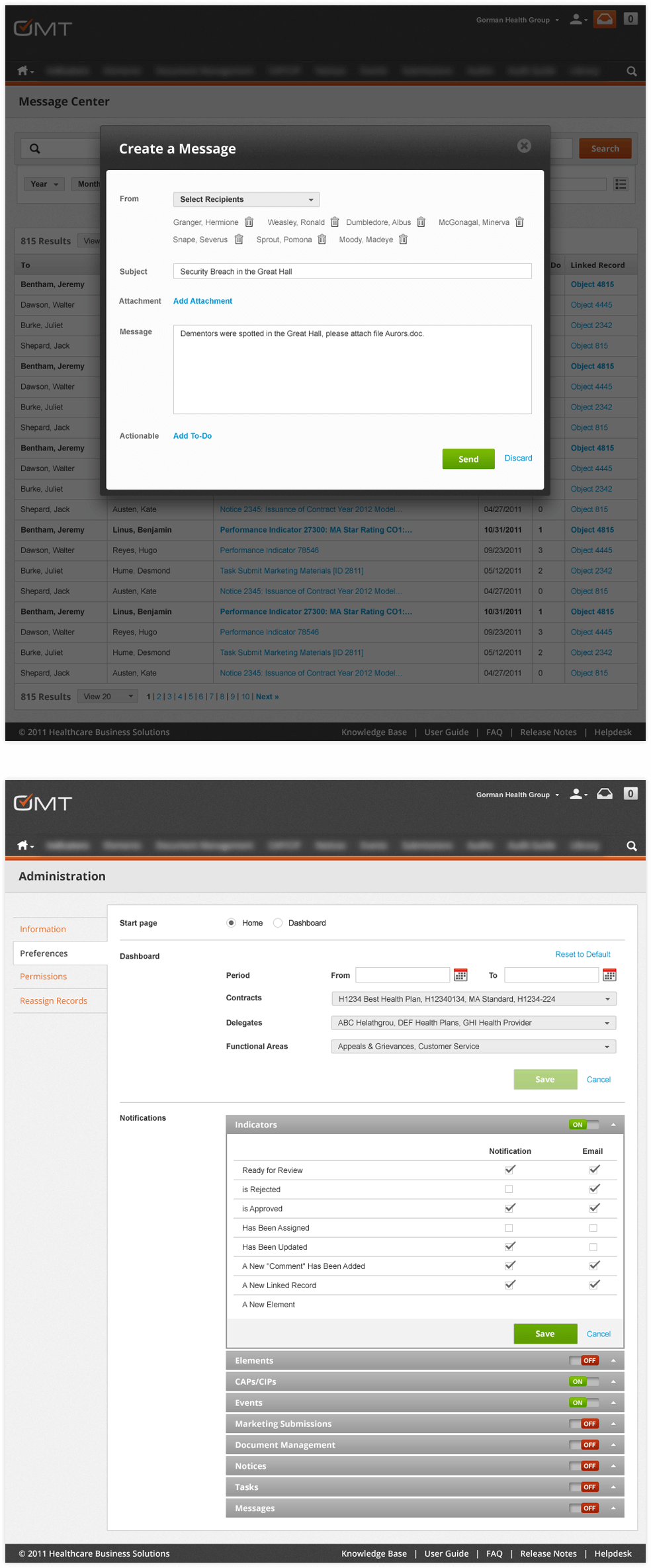
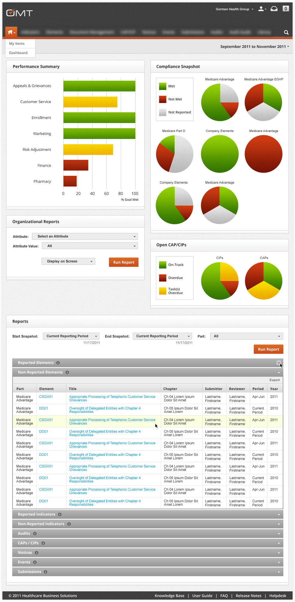
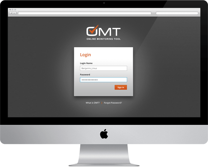
Gorman Health Group tasked RICO with redesigning one of their leading products: The Medicare Online Monitoring Tool. We redesigned the entire user interface from the ground up, not only designing a solution that was easy and pleasurable to use, but efficient as well.
Strategy
The OMT is an incredibly robust, and deeply layered application, making organization king. We sought to overhaul the current layouts, paths and visual indicators, to make using The OMT as simple and intuitive as possible.
Unifying Key Elements
We started by unifying like-pages. Standardizing the placement of key actions and indicators into toolbars ensured that familiarity with one page means familiarity with all pages. Key elements are located in the same place on every page.
Simplification
Secondly we began to simplify pages, working with OMT users to eliminate elements that were not germane to the process. This allowed us to “de-clutter” pages, which in-turn allows users to quickly navigate pages to their desired information.
Iconography
Next we transformed lengthy, repeating elements into visual, highly memorable iconography. Utilizing color, simplistic icons and easy tool tips we again reduced the amount of “clutter” per page, and allowed users to quickly find urgent materials in need of attention.
Deliberate Colors
We re-styled The OMT with deliberate use of color. Backgrounds and large areas of text were set in friendly neutrals, allowing important information to pop with color.
Hierarchy
A strong visual hierarchy was also established throughout the site, consistently from page-to-page. Headers, subheaders, forms, and body content are always the same size, reinforcing familiarity.
Custom Concealment
In addition we implemented a series of customizable tabs and expanding menu options to help users stay organized and focused, allowing them to hide what they don’t need.

We’d love to work with you on your next project.